Confidential names, stats and other info have been excluded, changed or dummied up.
Overview
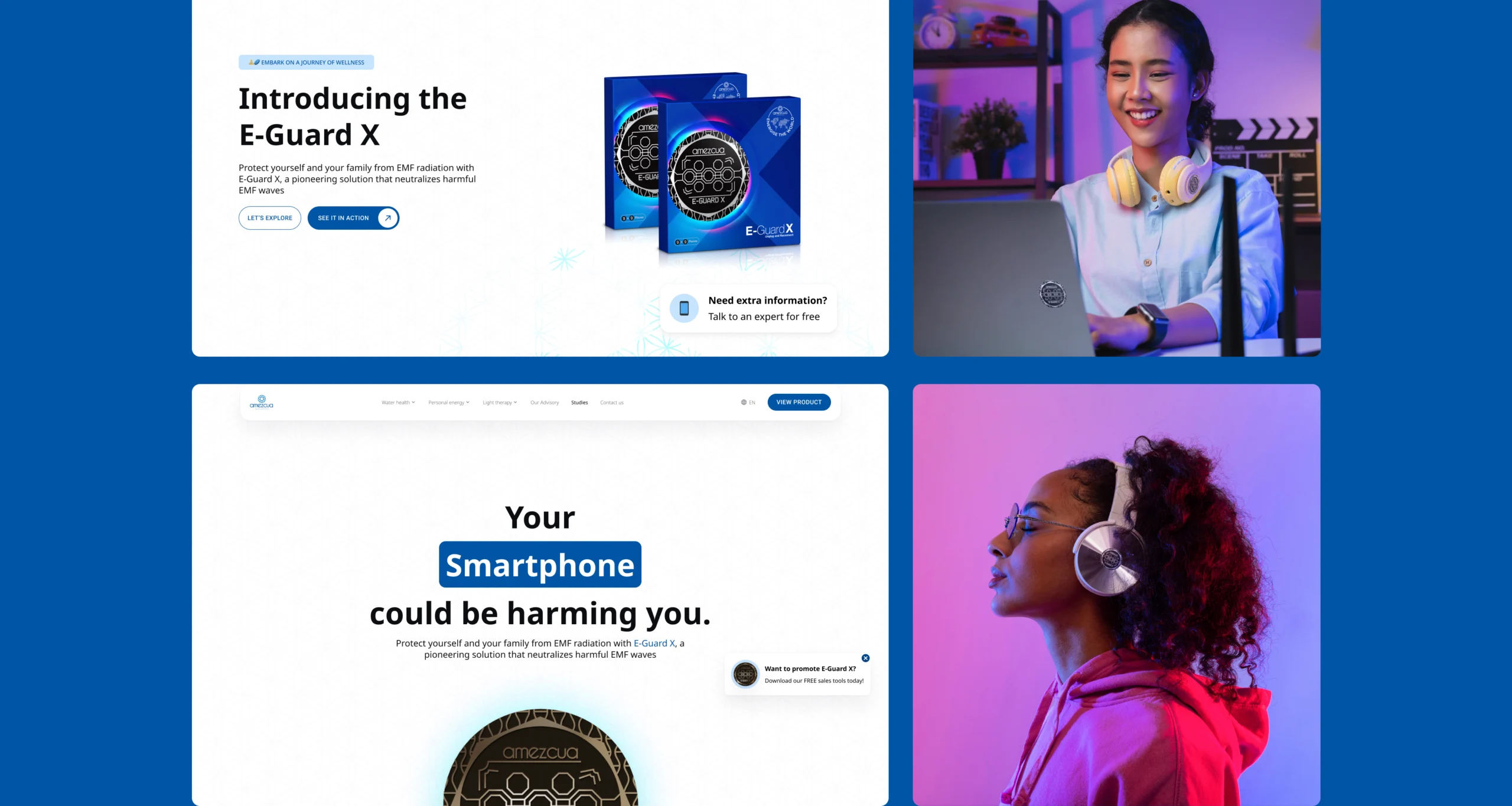
The E-Guard X is a product designed to protect users from excessive radiation exposure. The objective was to create an exclusive experience for the modern user.

The Challenge
We needed to deliver an accessible, lightweight design under tight deadlines while coordinating cross-functional teams to ensure quality and alignment. Our landing page had to achieve three primary goals:
- Educate users on the pain point and present the product as a solution.
- Engage potential customers through memorable storytelling.
- Drive conversions, particularly among mobile users in regions with low internet speeds.


Business Side
The landing page had to set a benchmark for future product launches, ensure accessibility and high performance for low-bandwidth users, and present the product as a premium health product.
User Side
We also had to build customer trust and reduce purchase hesitation through high-quality information and engaging content.
Discovery and Requirement Gathering
- Collaborated with the Communications (Comms) team for content and positioning.
- Refined textual and visual requirements alongside UX writers and operations supervisors.
- Identified touchpoints to maximize engagement and guide users toward conversion during user journey mapping
- Aligned technical feasibility with IT and development teams.

A/B Testing
A/B testing revealed many insights; autoplay videos are great for engagement but not so great for low bandwidth.
Educational Content Blocks included simplified explanations, before-and-after comparisons and testimonials to build credibility.
Accessibility and Performance-related decisions included optimized assets for low-speed internet areas, and inclusive design for small mobile screens.
Other innovative Features included interactive animations demonstrating product use, and Request-a-guide popups for additional training materials.


Handling Difficult Moments
We handled complex multi-departmental dependencies through Stakeholder management & centralized documentation
We also worked with content teams to transform excessive, text-heavy content into user-friendly copy while retaining the scientific depth.

I designed over 45 components and icons, and we delivered a working product in ~3 months. We also established a scalable template for future landing pages.
