Client
21st Century Learning
Scope
Full website redesign
Audience
K–12 educators, Asia-Pacific
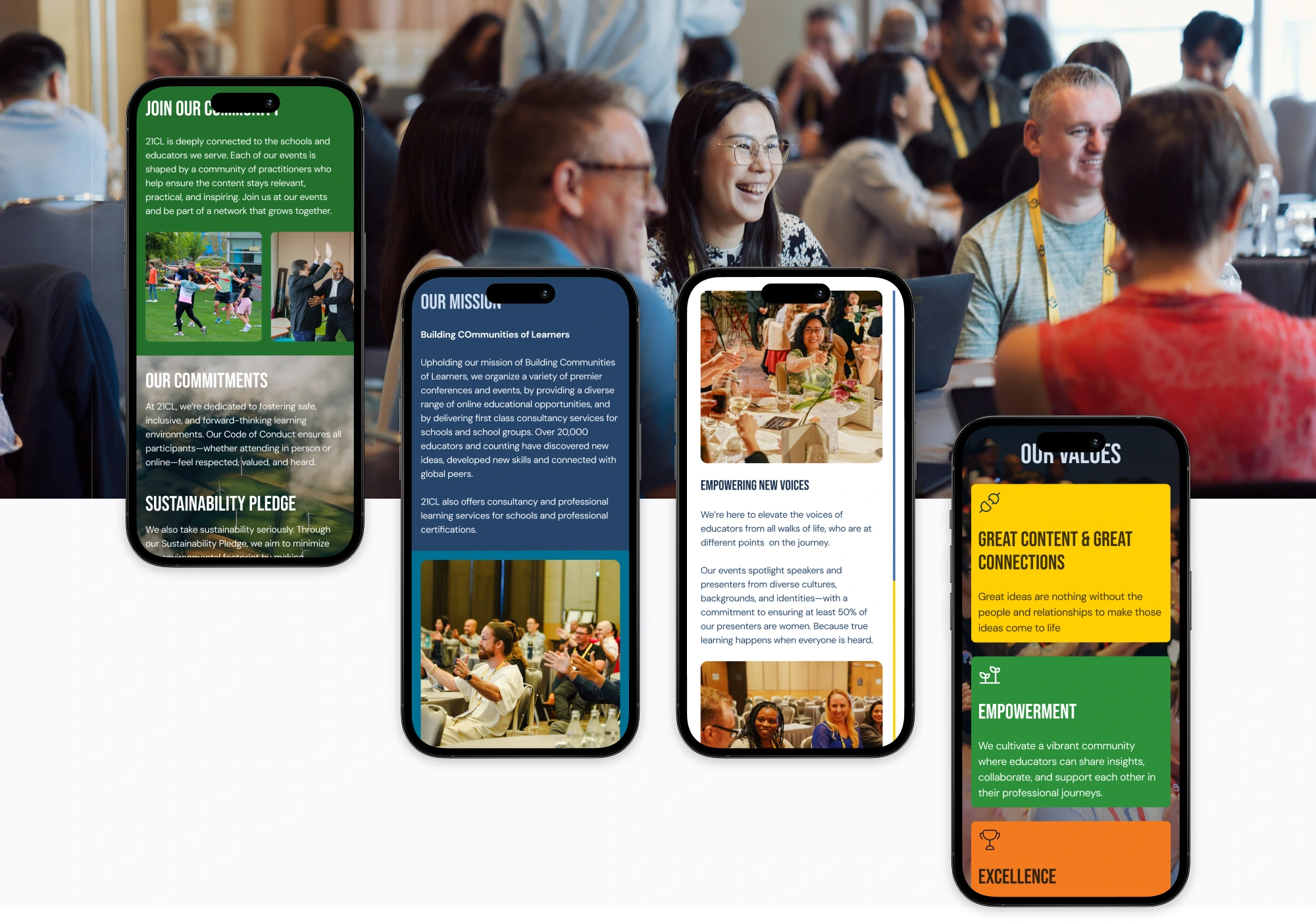
21CL has been building communities of educators since 2008; running conferences, certifications, webinars, and award programs across Asia-Pacific, with over 20,000 educators engaged. But their website told almost none of that story, and that needed to change.
Before
- Flat 5-item nav with no clear hierarchy
- Events, blog, podcast, and courses scattered across separate pages with no linking logic
- No filtering or tagging system for any content type
- Homepage: single testimonial, generic headline, no social proof
- Certifications buried inside “What We Do” with no dedicated space
After
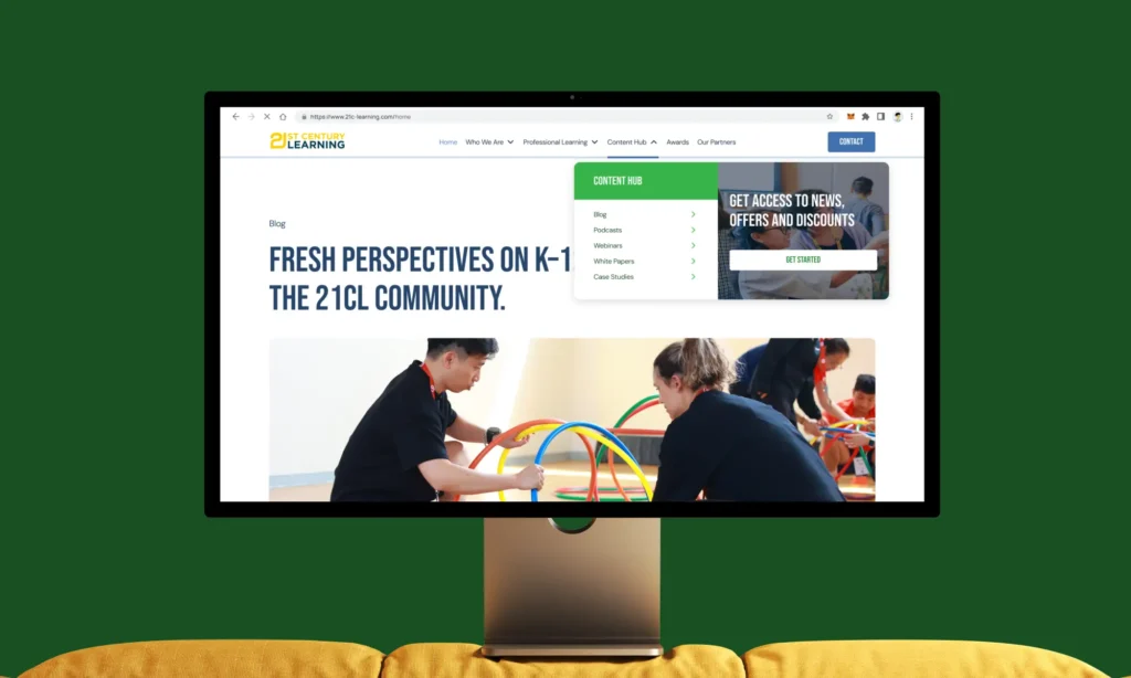
- 6-section nav: Home, Who We Are, Professional Learning, Content Hub, Awards, Our Partners
- All content types unified under a single hub with shared tag taxonomy (9 content pillars)
- Filter + sort on every gallery: events, blogs, webinars, case studies, providers
- Homepage: scrolling narrative with interactive event map, and dual testimonial sets
- Mega footer with newsletter signup, member associations, social, and site-wide links
What this case study covers
Six chapters, each focused on a distinct design decision, from the homepage narrative system to the content hub taxonomy to the certification page architecture.
Table of contents
Homepage
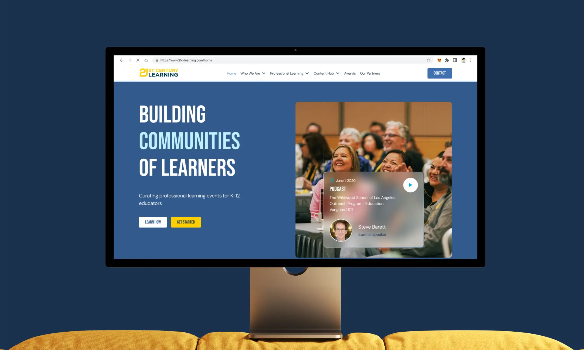
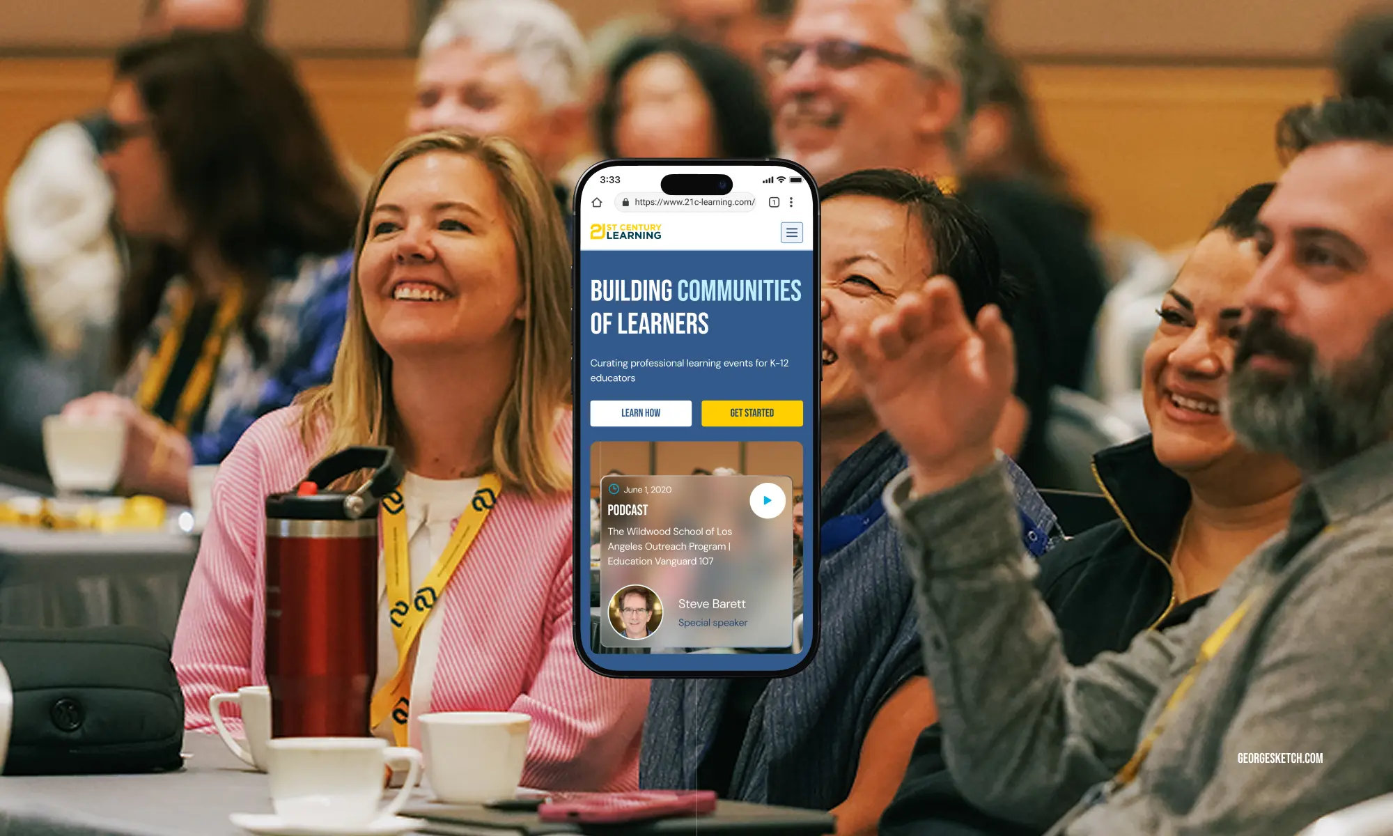
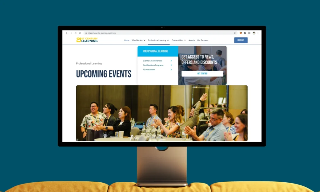
The homepage had one job: make a first-time visitor understand what 21CL is, feel the credibility of what they’ve built, and find a reason to go deeper. The old site opened with a generic tagline and a single testimonial. The new one tells a story in eight acts.
Each section of the homepage was designed with a specific persuasive function not just around “what goes here” but “what does the visitor need to believe at this point in the scroll.” The sequence moves from awareness to trust to action.
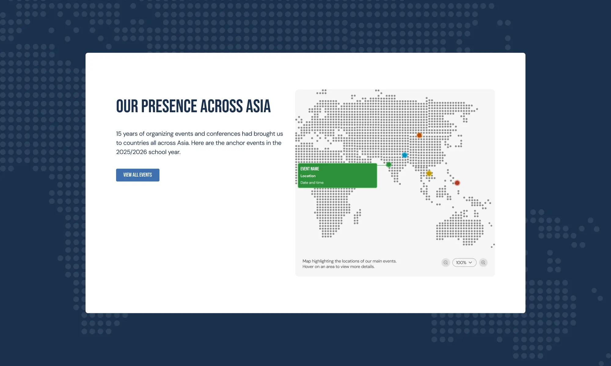
The interactive map was one of the client’s most specific requests, and one of the most meaningful additions. 21CL runs events across several countries. The implementation uses two PNG states, with pulsating dots on the map displaying event details on hover.
Navigation & information architecture
The old navigation reflected how 21CL had grown: organically, additive, without a deliberate structure. Items were added as the organisation added services, without revisiting the overall logic. The result was a menu that made sense only if you already knew what you were looking for.
The redesign organised everything around six top-level destinations, each representing a distinct user intent. Sub-pages nest naturally under their parent — there’s no moment where a user needs to guess which section something lives in.
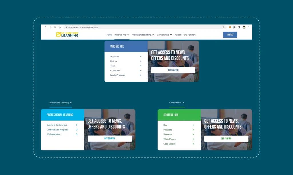
A minimalist top bar with a dropdown mega-menu for sections with sub-pages. Designed to feel closer to TED or Web Summit than a traditional conference website.
Good IA is invisible. A user who finds what they need without thinking about where to look has been served by good architecture. The test for every item was: “If I’m an educator looking for X, is this the first place I’d look?”
Content Hub
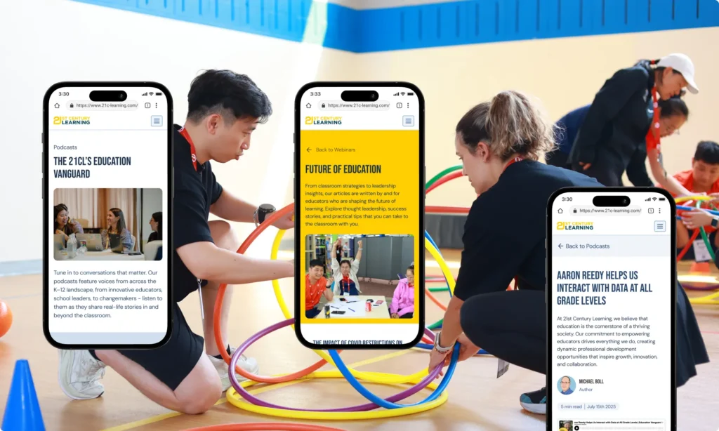
21CL produces a significant volume of content across five distinct formats. Before the redesign, each lived in a separate corner of the site with its own logic, its own navigation path, and no shared taxonomy. A visitor who found a webinar had no obvious route to a related blog post or white paper on the same topic.
The Content Hub brought everything under one roof — and, critically, under one tagging system.
A minimalist top bar — clean, no decorative elements — with a dropdown mega-menu for sections with sub-pages. Designed to feel closer to TED or Web Summit than a traditional conference website.
The deeper principle: Good IA is invisible. A user who finds what they need without thinking about where to look has been served by good architecture. The test for every item was: “If I’m an educator looking for X, is this the first place I’d look?”
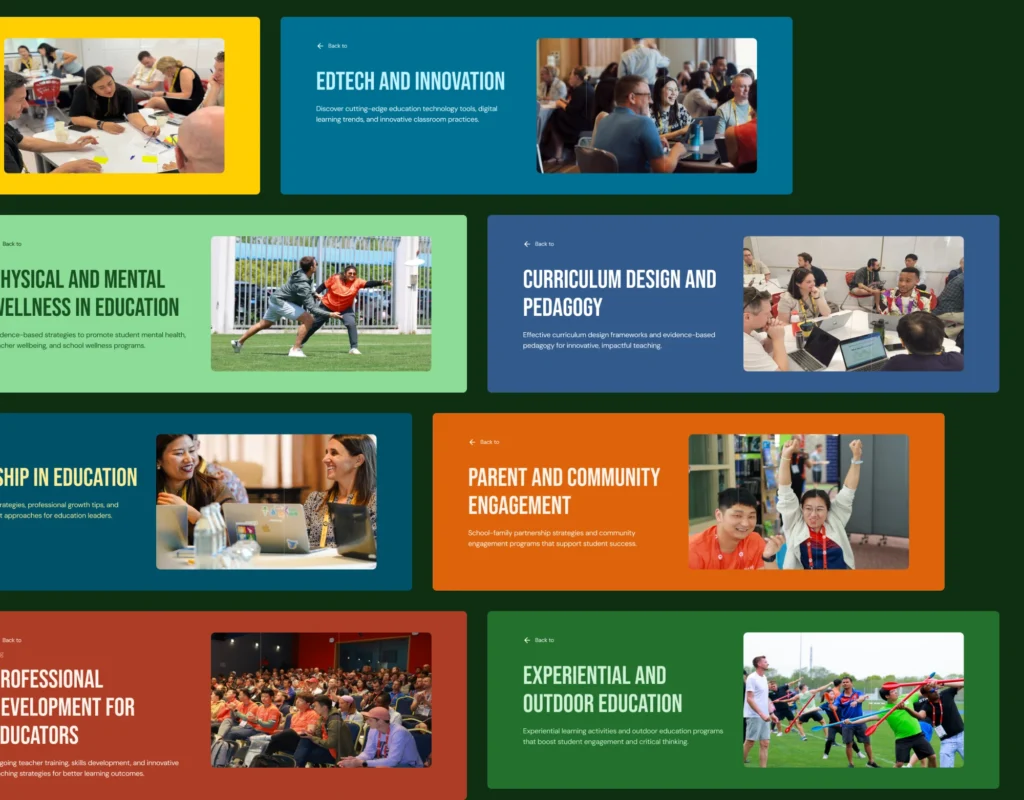
Taxonomy & color-coding: Each content type was assigned its own color identity across the hub — so a visitor browsing the Content Hub can immediately distinguish a webinar card from a blog card at a glance, without reading the label. Type becomes visual.
Every piece of content across all five types is tagged with one or more of 21CL’s nine content pillars. These tags do double duty: they let users filter within a content type, and they create implicit connections across types — a visitor interested in EdTech can find blogs, webinars, and white papers on that topic from a single filter selection.
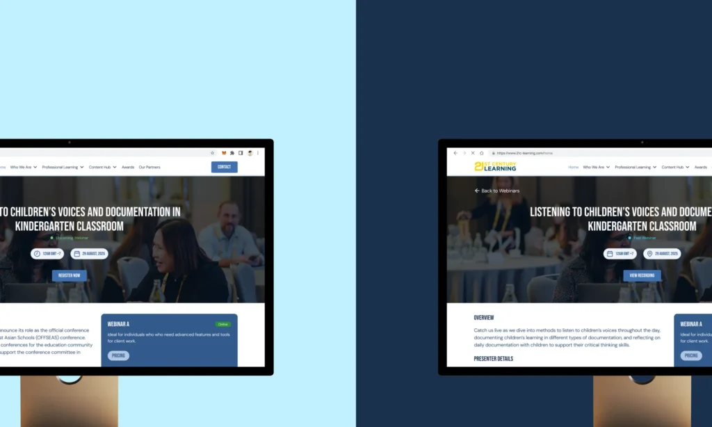
Webinars introduced a specific UX challenge: upcoming sessions needed registration (on a third-party platform), while past recordings needed controlled access via a simple lead-gen form. The default sort — upcoming before past — was a functional decision, not just aesthetic. It keeps the page commercially active even when the current calendar is sparse.
Event listing & event profiles
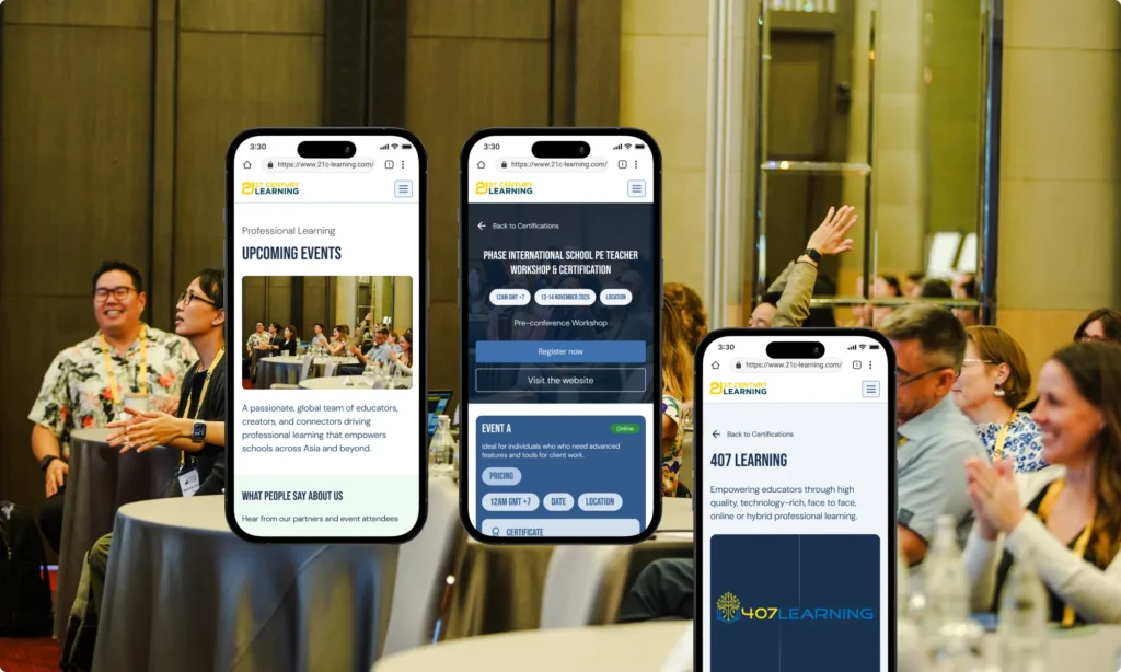
Events are 21CL’s core product. The event listing and event profile pages are where the site earns its keep — they’re the path from “I’m browsing” to “I’ve registered.” Designing this flow meant thinking about two very different users: the educator actively looking for a specific event, and the one who’s just discovering what 21CL does.
The “+ Calendar” CTA on the card itself was an intentional addition: a visitor who isn’t ready to register but doesn’t want to lose the event can act without committing. It’s a micro-conversion that keeps 21CL in their orbit.
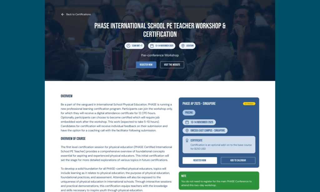
Certifications are 21CL’s highest-commitment offering. A visitor landing on a certification page has already decided they’re interested — the design’s job is to give them everything they need to say yes, without making them work for it. These pages carry more content per scroll than anywhere else on the site.
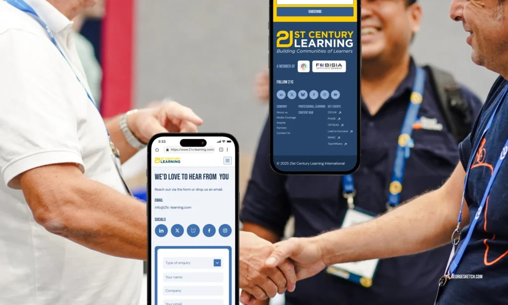
The footer design
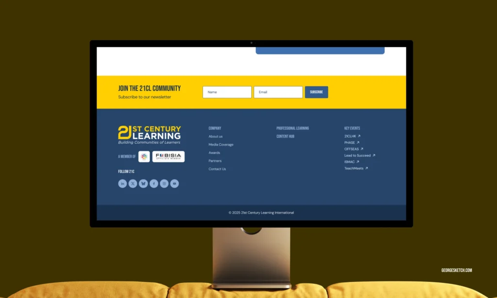
Inspired by Web Summit and TED — specifically the combination of a rich mega footer with a minimal functional socket bar beneath it. Two layers, two different audiences: the mega footer serves someone who wants to go somewhere; the socket serves someone who wants a legal link or a quick copy of the privacy policy.
Key events as a footer column: The individual event websites (21CLHK, PHASE, OFFSEAS, etc.) each have their own domains. Linking to them from the footer with an external arrow icon acknowledges that these are distinct properties while keeping the parent brand in view. It’s a micro-navigation for power users who already know which event they want.
Member associations in the logo position: Placing the FOBISIA and EARCOS logos in the footer’s most prominent left column — beneath the 21CL logo itself — communicates institutional standing without a page of text. Anyone in the K-12 international school world recognises those associations immediately. It’s social proof that works in two words.
The newsletter placement: The newsletter signup sits inside the footer’s first column, not in a full-width banner above the footer. This was a conscious choice — a banner-style signup feels like an interruption at the end of a page. Tucked into the footer column, it feels like a natural next step for someone who’s already decided to stay connected.
I also designed over 100 custom components to keep everything feeling consistent and personalized.
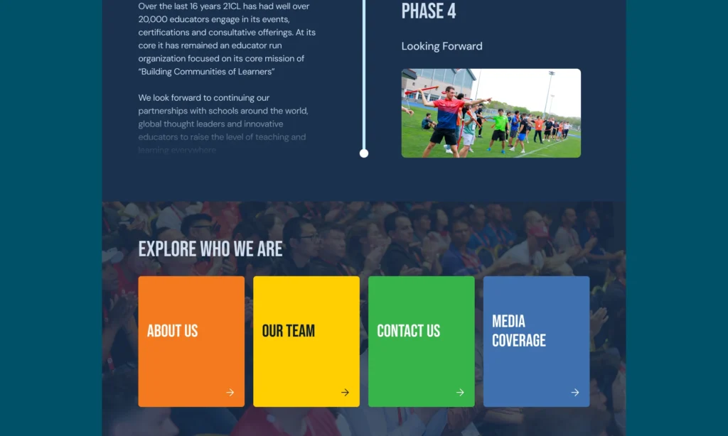
The new site is a visual refresh, as well as a structural rethinking of how 21CL presents itself to three distinct audiences — educators browsing for PD, schools and organisations considering partnership, and institutions nominating for awards — and gives each of them a clear, navigable path through a site that previously made all three work too hard.